How to Make a Professional Logo with AI in 10 Minutes (Step-by-Step with Design.com)
A few years ago, making a professional logo took days. You briefed a designer, waited for drafts, and paid hundreds of dollars for the privilege. Today you can do it yourself in about ten minutes, and the result can look just as good.
I make logos for side projects and small clients regularly, and my current go-to tool is Design.com. It has the largest logo library I have found, over 500K, designs, and its AI editor lets you change almost anything by typing a sentence.
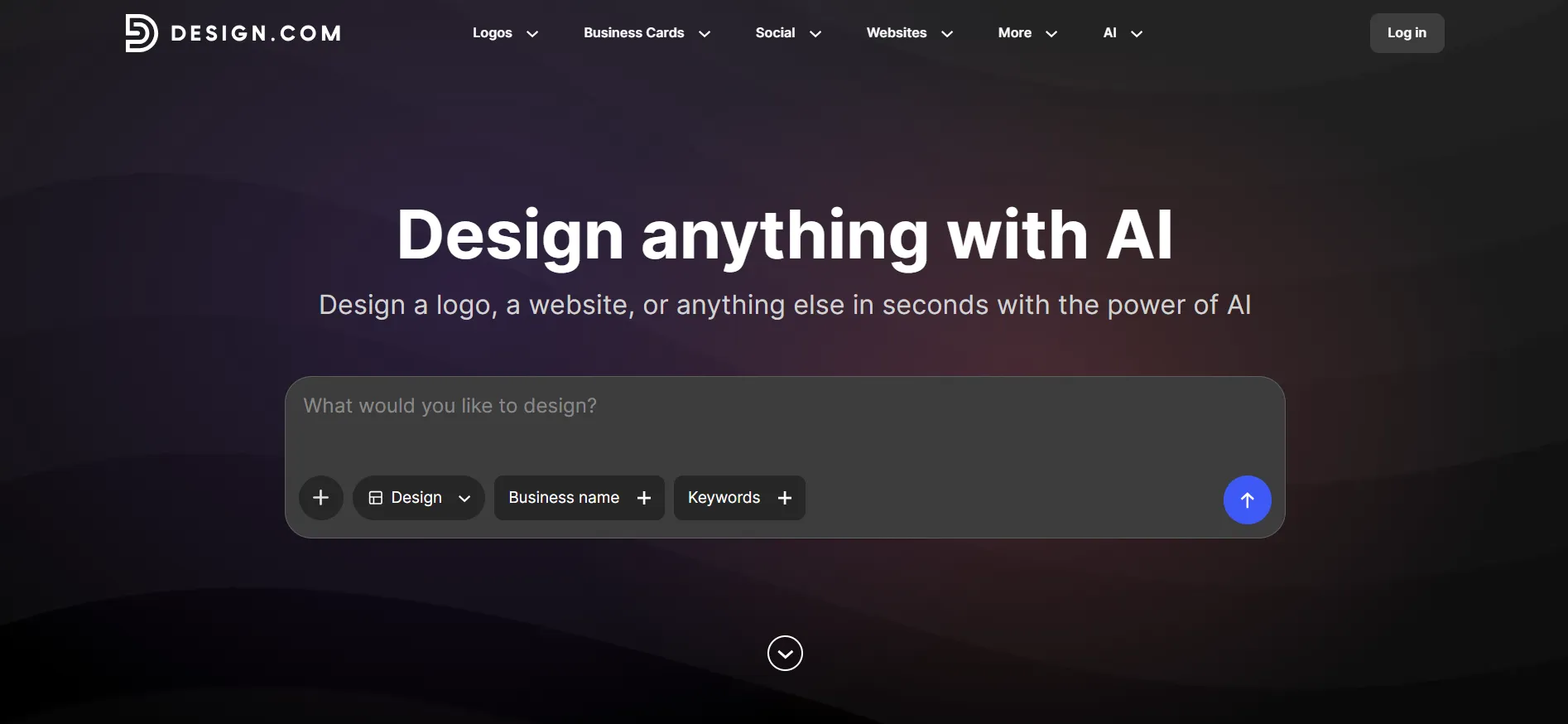
In this “How to Make a Professional Logo with AI“ guide I will walk you through the exact process I use, step by step. Follow along, and you will have a finished, download-ready logo by the end.
What you need before you start
Three things, and none of them cost money:
Your business name. If you have not decided yet, decide first. Changing a name later means making the logo again.
A rough idea of your style. Modern or vintage? Bold or minimal? Colourful or monochrome? You do not need certainty, just a direction.
Ten minutes and a browser. The tool works on your phone too, but I prefer a bigger screen for choosing fonts.
That is it. No design skills required. I am not a designer, and I have made logos for a coffee brand, a consulting firm, and a YouTube channel with this exact process.
Step 1: Go to Design.com and enter your business name
Open the Design.com homepage and find the logo maker. Type your business name into the box. You can also add a short line about what you do. I usually write one sentence, like “small bakery specialising in sourdough.”
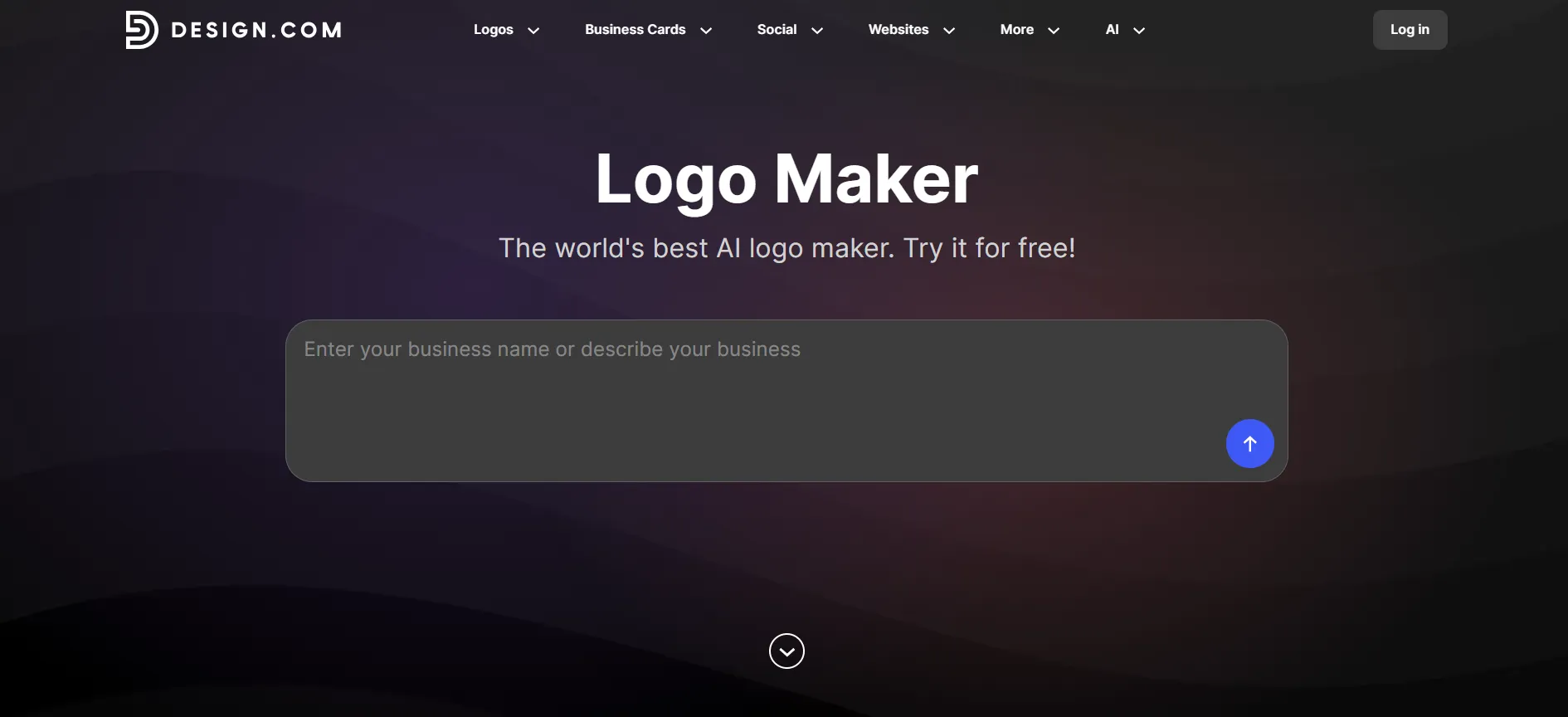
Hit enter. The AI starts working immediately.
Step 2: Let the AI generate your first batch
Within seconds, you can generate logo options tailored to your business name and industry. Instead of settling for just five designs, you’ll have dozens of creative concepts to explore. The more options you get, the better your chances of finding a logo that matches your brand’s style and vision.
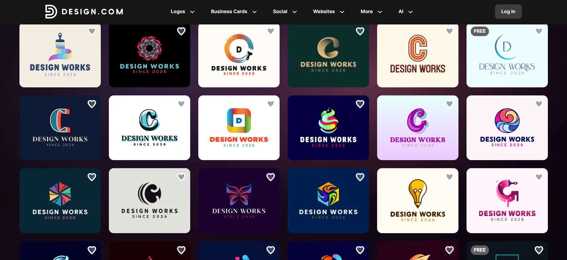
Do not pick anything yet. Scroll through the whole batch first and note which styles grab you. Are you drawn to icons, wordmarks, or badge-style designs? This tells you what to refine next.
Time check: about two minutes in.
Step 3: Refine with keywords
Now get specific. Type keywords into the refinement box to steer the AI. This is the step most people skip, and it makes the biggest difference.
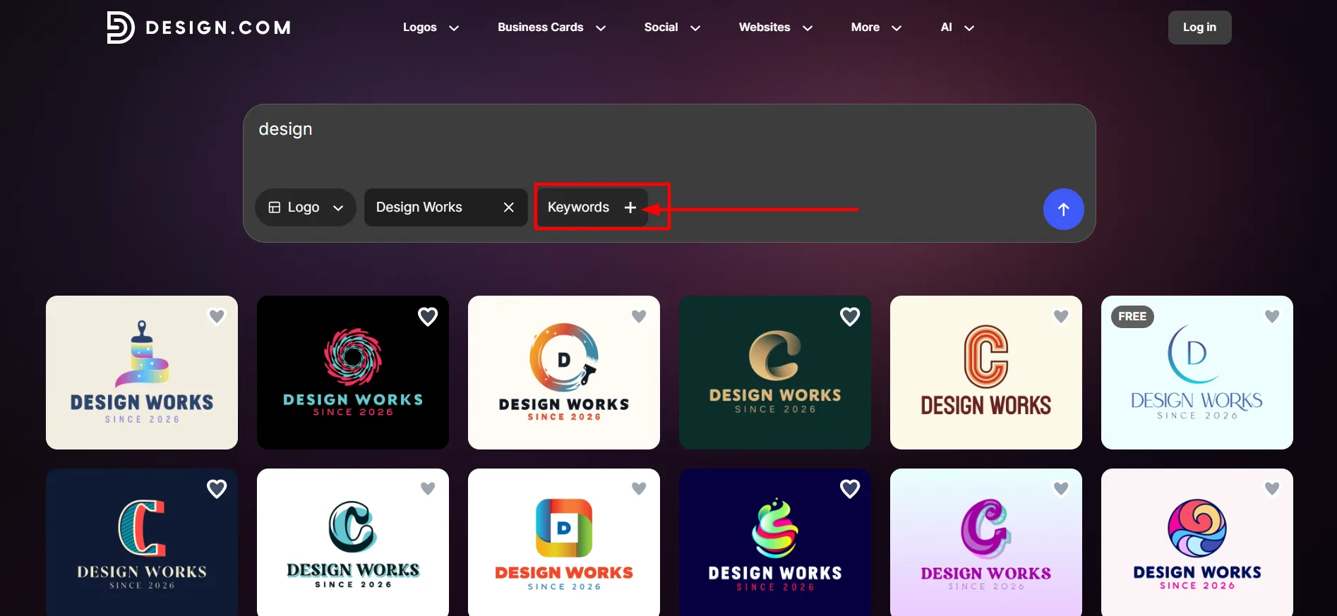
Good keywords to try:
Style words: “minimal,” “vintage,” “playful,” “luxury,” “geometric”
Subject words: “mountain,” “coffee cup,” “wave,” “letter A”
Colour hints: “gold and black,” “pastel,” “monochrome”
I usually run two or three refinement rounds. Each one produces a fresh batch based on your new direction. If a batch misses, adjust the keywords and try again. The AI handles vague input fine, but specific input gives you sharper results.
Time check: four minutes.
Step 4: Shortlist your top three
See something you like? Hit the heart icon. That saves it to your shortlist. Pick your top three and stop scrolling.
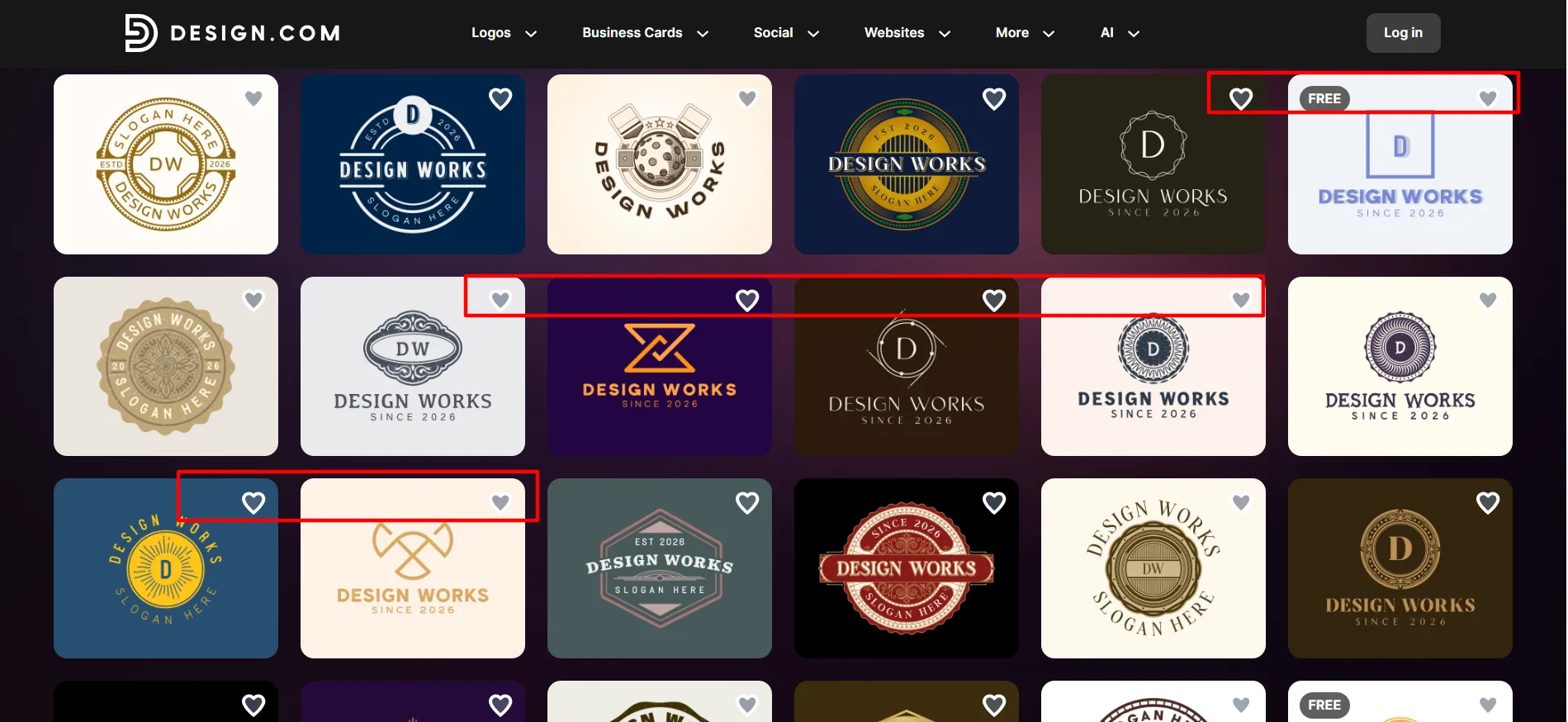
Why three? Because choosing one logo from two hundred options leads to second-guessing. Three finalists keeps the decision quick and gives you backups if your favourite fails the next step.
Step 5: Customise with the AI chat editor
This is the part that surprised me the first time. Design.com‘s editor includes an AI chat. You type what you want changed, and it changes it.
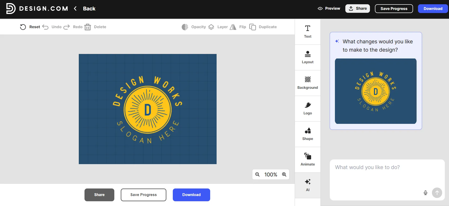
Things I have typed during real projects:
“Make the font bolder”
“Swap the icon for something simpler”
“Change the colours to navy and cream”
“Make the text curved”
Each change takes seconds. If the AI misreads you, rephrase and try again. You also get manual controls for everything: over 500 fonts exclusive to the platform, custom colours and gradients, curved text, and a library of more than 62,000 vector shapes. I mostly use the chat for big changes and the manual controls for fine tuning.
Spend your remaining time here. Small changes to spacing, colour, and font weight are what separate “AI template” from “professional logo.”
Time check: seven minutes.
Step 6: Test it in the real world with mockups
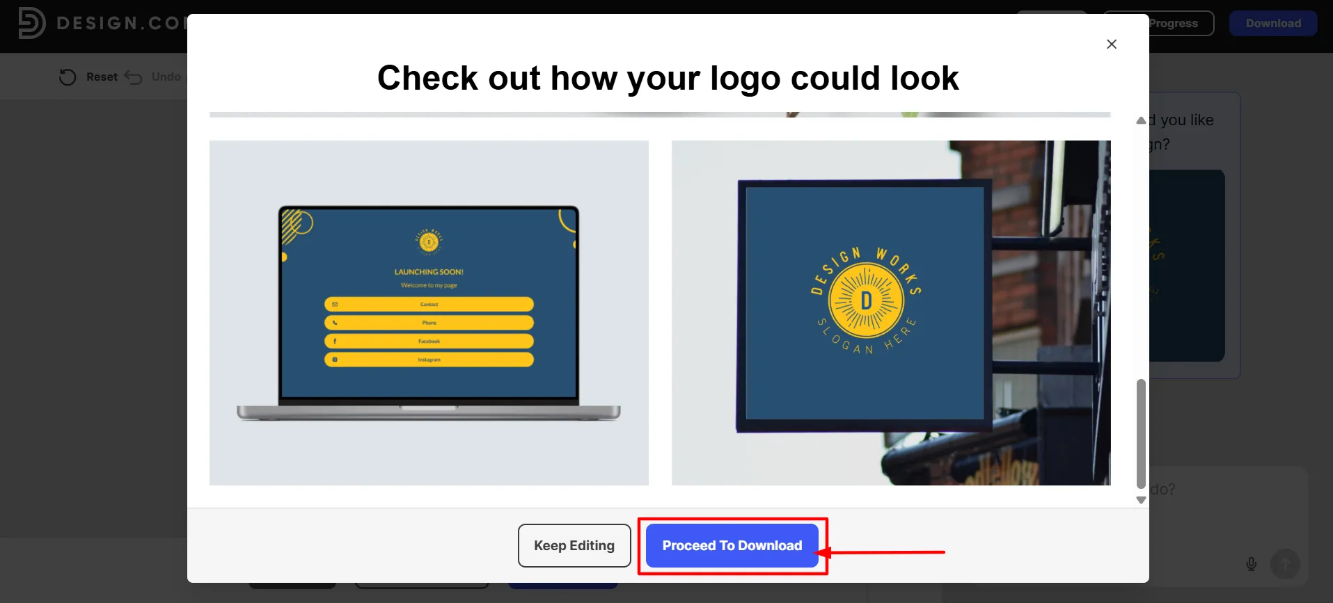
Before you download anything, preview your shortlist on the real-world mockups. Design.com shows your logo on business cards, shop signage, a website, and merchandise.
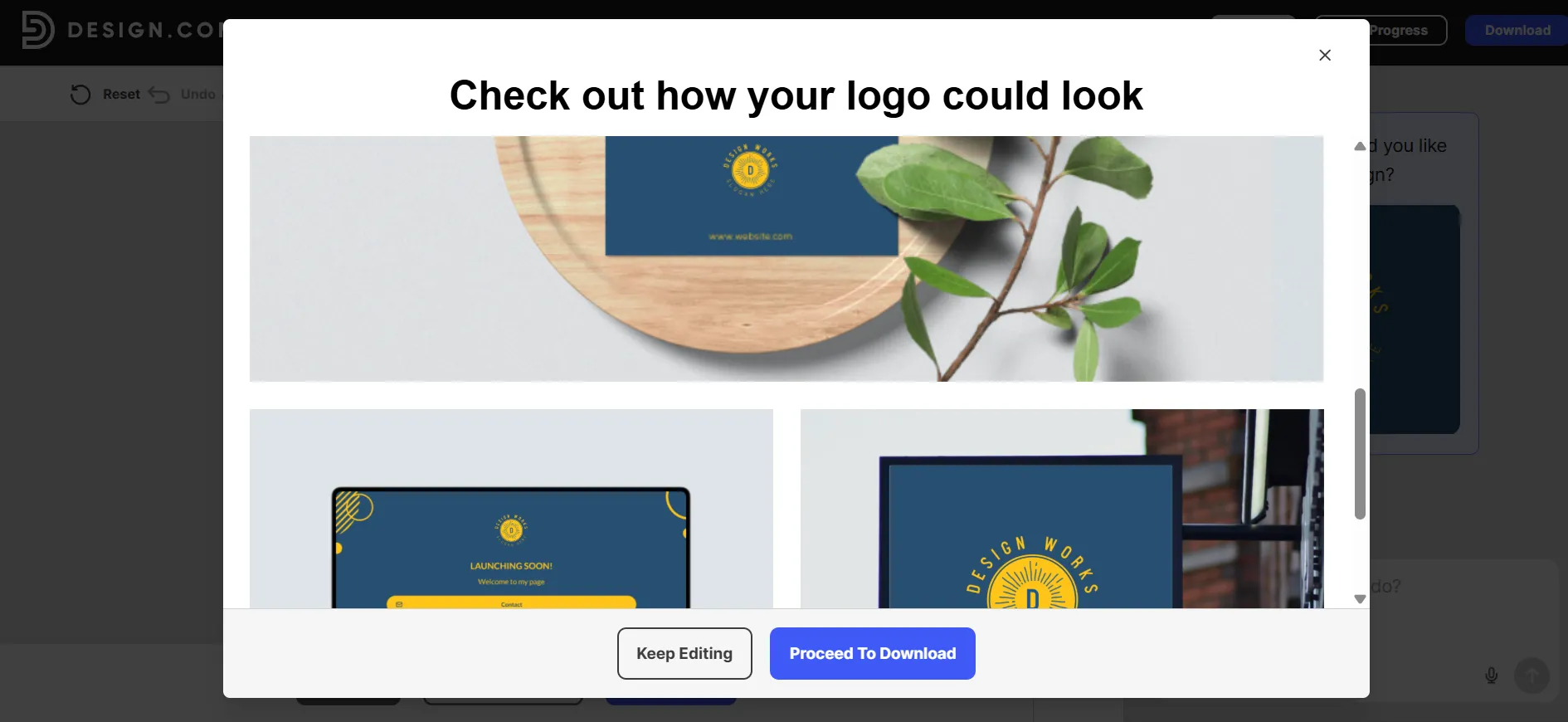
Check three things:
Does it read clearly at small size, like an Instagram profile picture?
Does it work in one colour, like an invoice header?
Does it look right next to competitors in your industry?
One of my finalists looked sharp on screen but disappeared on a dark shop sign. The mockups caught it before I wasted a download on the wrong choice. Swap in a backup from your shortlist if needed.
Step 7: Download every file format
Happy with the result? Download it. Design.com gives you the full set in one go:
PNG and JPG in high resolution for websites and social media
SVG, EPS and PDF vector files for print, signage, and large formats
A transparent background version
Multiple variations of your logo
Design.com stores your files forever in your account. If your laptop dies next year, your logo is still there.
The free plan includes real downloads with no watermarks, which is rare. Paid plans unlock the premium template library plus the wider brand kit: business cards, letterheads, email signatures, social templates, and a website, all coloured automatically to match your logo.
Time check: ten minutes. Done.
My tips for a better result
After making a lot of logos this way, a few rules keep proving themselves:
Keep it simple. Three colours or fewer. Clean fonts. Simple logos survive every size and every background.
Check your competitors first. Search your industry on the platform. If every rival uses a mountain icon, pick something else.
Do not chase perfect. A good logo launched today beats a perfect logo launched in three months. You can refine it later, and unlimited edits mean “later” is always an option.
Say your tagline out loud. If you add one, keep it to three or seven words. Short reads better on a logo.
Buy the extended license if exclusivity matters. Free and standard logos stay in the library for others to use. The extended license removes your icon from the library so nobody else can have it. Worth it if you plan to trademark.
Common mistakes to avoid
Picking the first decent option. Spend your time in Step 3. Refinement is where quality comes from.
Ignoring the mockups. Logos that only look good on a white screen cause expensive reprints.
Ten fonts and six colours. Restraint looks professional. Clutter does not.
Skipping the shortlist. Deciding between two hundred options burns time and produces worse choices.
Quick Links:
Wrapping up: How to Make a Professional Logo with AI?
Ten minutes is genuinely enough when the tool does the heavy lifting. Enter your name, generate, refine with keywords, customise with the AI chat, check the mockups, and download every format. That is the whole process, and it works whether you are launching a coffee shop or a consulting firm.
If you want to try it right now, head to Design.com, type in your business name, and see your first batch of logos in under a minute. The free plan lets you go all the way to a finished, downloadable logo before you spend anything.
